pigeonstudio ℗ is a graphic design studio based in Chongqing and Taiwan with diverse cultural perspectives.
The essence of design is communication. Communication occupies most of our project time. We solve problems and bring value through communication and design.
We do not blindly follow trends, maintain a classic and unique understanding, and strive to find a balance between commercial needs and visual perfection.
type:Visual Identity、packaging
art director:鸽子
designer:鸽子、jiangx
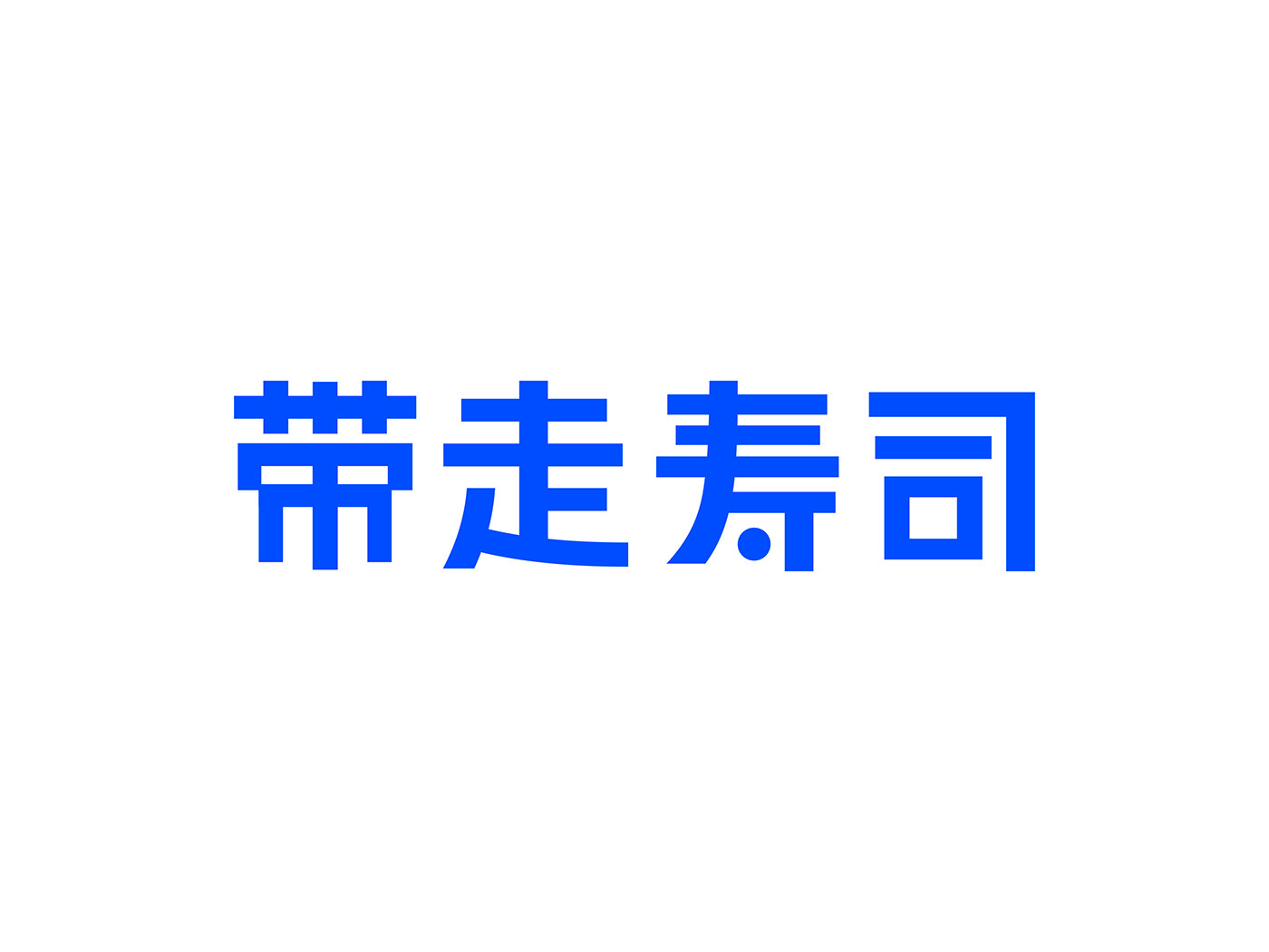
client:TAKE SUSHI
●
TAKE Away Sushi is a to-go sushi brand. The chef studied professional sushi in Japan. Echoing the concept of "TAKE AWAY "of the brand name, we hope that people can have fast, safe, professional and delicious Japanese sushi at a low price.
In the current prevailing take-out culture, it is hoped that consumers can feel the interesting brand energy in their daily fast consumption, and will be impressed with a smile when they see the take-out packaging of the brand.
Therefore, a sumo wrestler covered with sashimi is chosen as the brand symbol to convey the brand concept of full energy to consumers. A sumo wrestler who cleverly combines sushi shape with creeping, and connects with consumer items in an interesting way.
●
TAKE帶走壽司是一家主打外帶的壽司品牌。主理人在日本學習專業的壽司料理。呼應品牌名的"TAKE AWAY“概念,希望以低價格就能讓大家吃到快捷,安心,專業,美味的日式壽司。
在外賣文化盛行的當下,希望消費者在快速消費的日常中,能感受到有趣的品牌能量,在看到品牌的外賣包裝能夠會心一笑並留下深刻印象。
因此選用一個被生魚片覆蓋的相撲力士作為品牌符號,傳遞想給消費者滿滿能量的品牌理念;巧妙結合壽司造形與匍匐的相撲力士,以有趣的方式與消費品項產生連結。
在外賣文化盛行的當下,希望消費者在快速消費的日常中,能感受到有趣的品牌能量,在看到品牌的外賣包裝能夠會心一笑並留下深刻印象。
因此選用一個被生魚片覆蓋的相撲力士作為品牌符號,傳遞想給消費者滿滿能量的品牌理念;巧妙結合壽司造形與匍匐的相撲力士,以有趣的方式與消費品項產生連結。
●
作者:pigeonstudio
著作权归作者所有。
商业转载请联系作者获得授权,非商业转载请注明出处。
Copyright pigeonstudio ℗ All rights reserved.